The most difficult and the most interesting project of the year 2016. Incredible development team, unique workflow and valuable talk about lofty matters over Chinese tea.
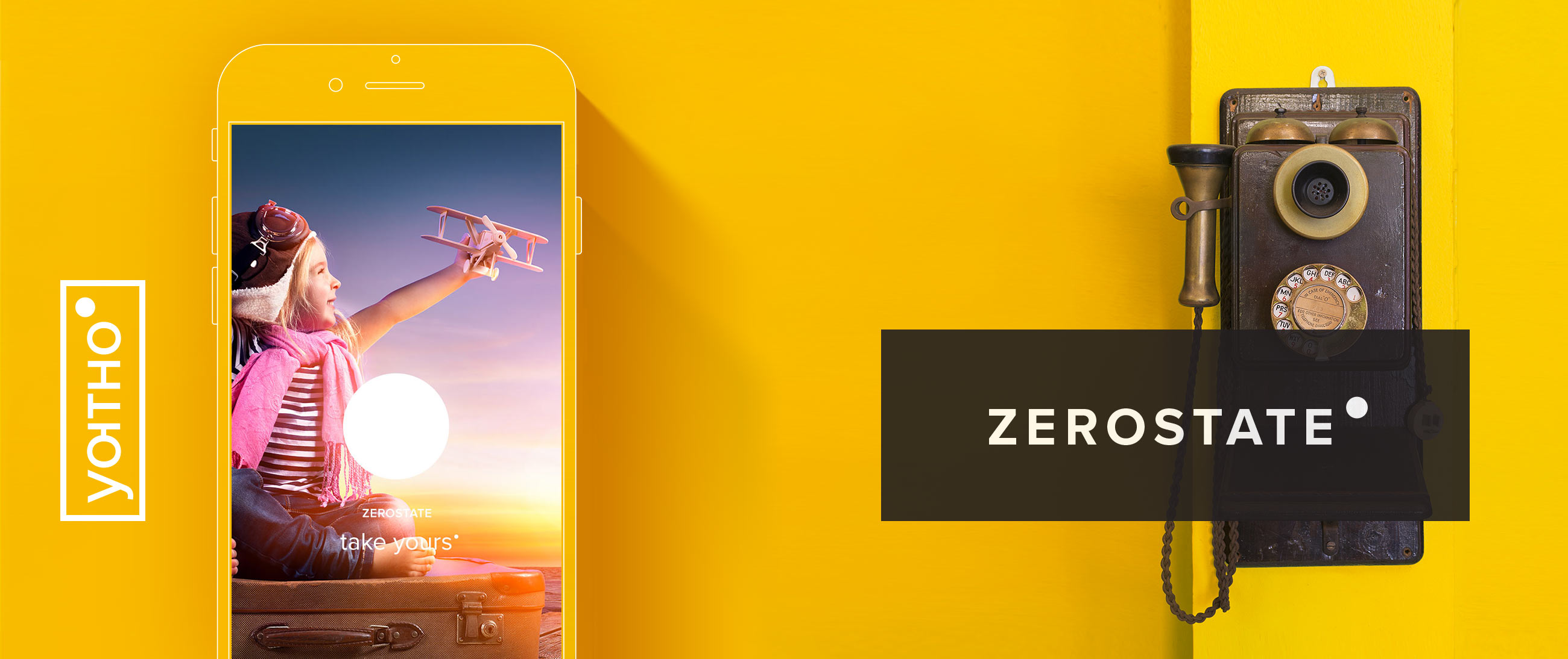
About the logo
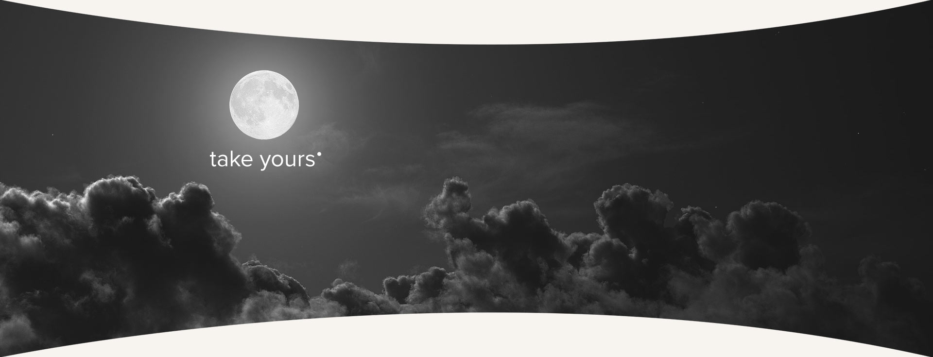
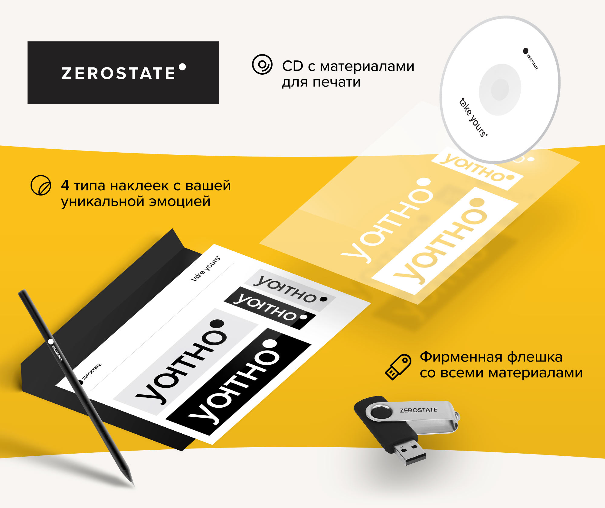
The point is that the logo is actually a circle. Zero, nothing, emptiness, a black hole. I had nothing left to do but take the plunge. To my surprise I could not find a single just-a-circle logo for the whole week. As a result, it became not only the service symbol, but also the main function key. Unfortunately, only in the release beta-version.
So, the logo:
The work was done in unusual environment. To implement the project, I landed in an office for the first time in five years. The experience was amazing and, most importantly, as positive as it could be. Freelance gives freedom and the opportunity to choose; teamwork is a level up.
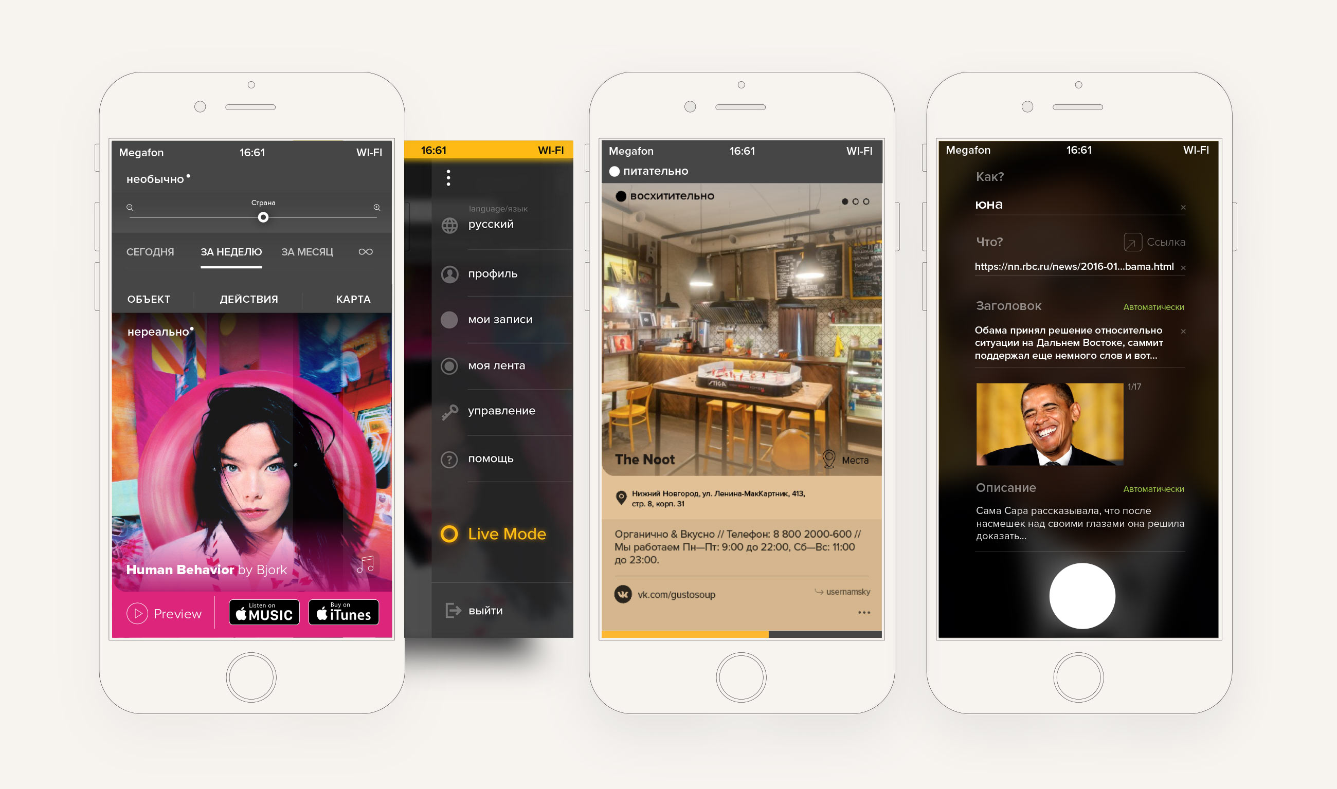
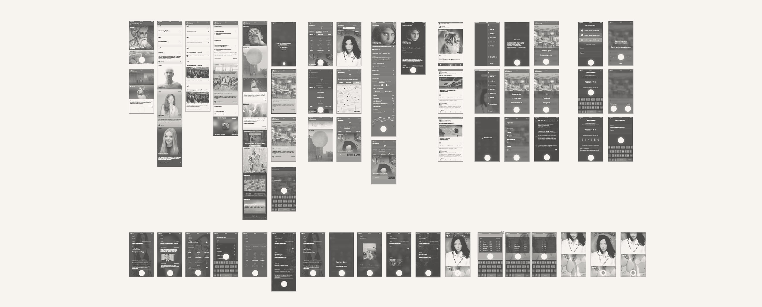
50 screens are good concentration practice.
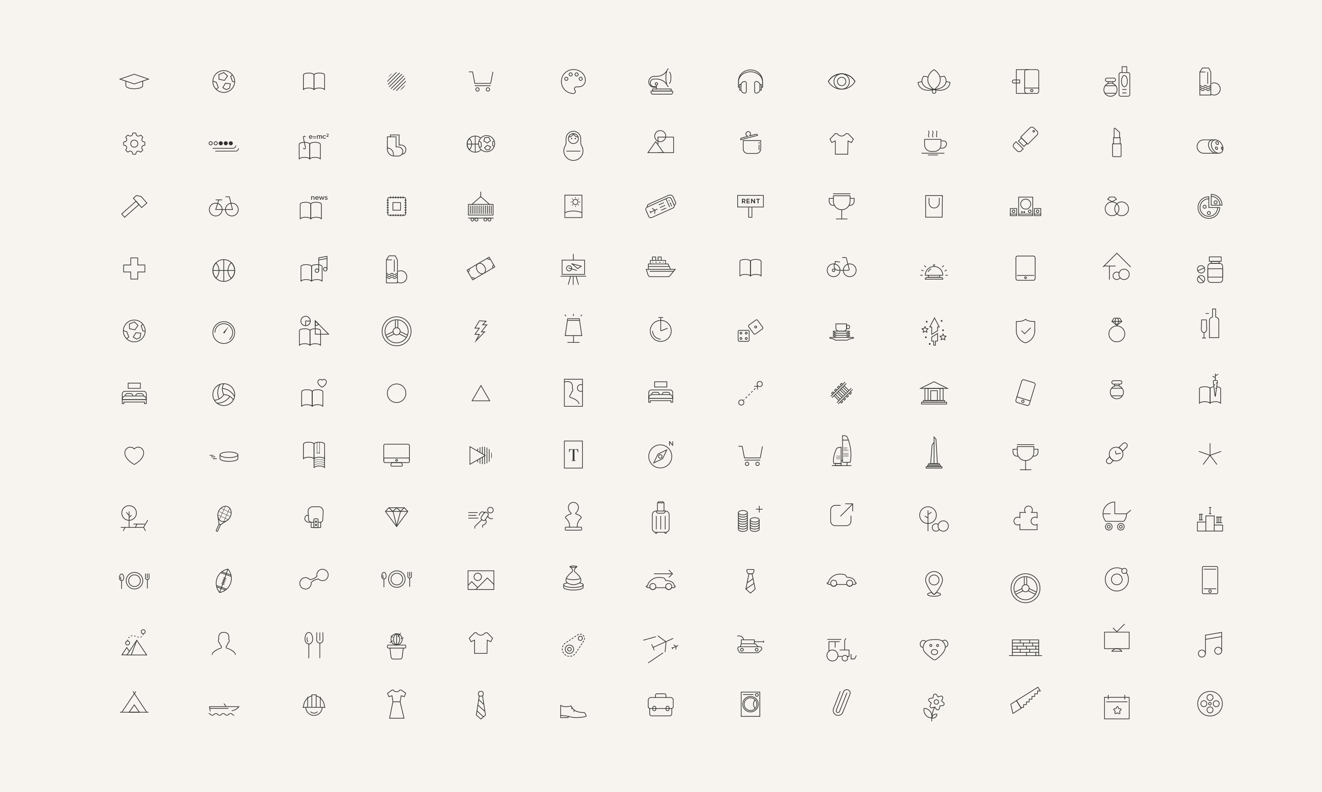
Another 200+ minimalistic icons for all categories and subcategories.
The logo proved to be very universal.
«In addition to the perfectly and professionally performed work, I got a live example showing how a real designer differs from an illustrator, and harmony differs from beauty. Now I know that the impossible is possible - feelings, emotions and sensations can be visualized. Our cooperation has grown into a friendship, which I am incredibly happy about. As well as the fact that I no longer need to choose a designer for my ideas. My choice is obvious and unopposed».
— Paul Petrov
IdeMind,
ZeroState